Accessibility Review (with AI)
I recently completed the W3Cx: Introduction to Web Accessibility course as a refresher on the WCAG (Web Content Accessibility Guidelines). It was a well-structured and informative course and I liked that there were lots of multiple choice quizzes throughout the course to check my understanding. However, there were few opportunities to apply what I was learning during the course. After I finished the course, I decided to apply what I had learned to improve this website's accessibility.
I also recently read Leon Furze's blog post about using Claude to create personal websites. In that article, Leon used Claude Code to do an accessibility audit of the websites he had generated. I was interested in trying this out myself, as I was curious to see what accessibility improvements an AI would identify, compared to those that I identified.
This website
I mainly use this website to show projects that I've worked on over the last 10+ years. It's a static website, which means the pages are pre-built and display the same content to every visitor. The site is hosted using GitHub Pages and is implemented using Jekyll (a static site generator).
I have updated the website every so often with new pages for projects I've been working on but have rarely made changes to the layout or presentation. After completing the W3Cx course and looking at my website again recently, I realised that there were many changes I could make to improve its accessibility. I focused on the 17 pages of the website used for sharing my work.
Some examples of issues related to accessibility I had noticed were:
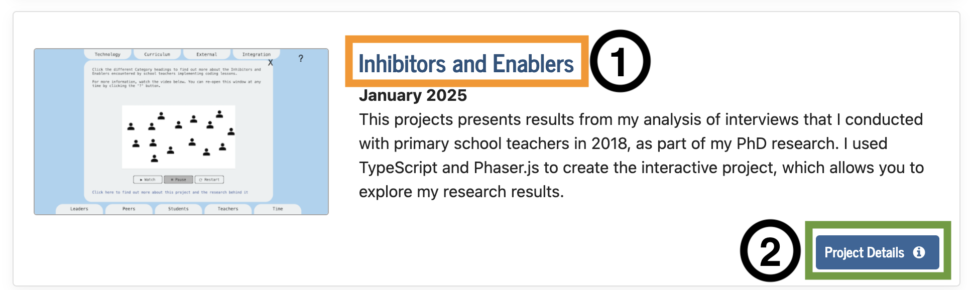
- Links and buttons that were repetitive, like those shown in the image below, which can be annoying for people who navigate sites by tabbing through links with a keyboard (or accessibility device)
- Images that were missing alternative text, which would be read out to explain images when a visitor is using a screen reader and cannot see the images
- Low contrast text on figure captions, where there was light grey text on a white background, which visitors with low vision would find hard to read
Although many visitors to my website would likely be able to navigate the site well, the issues I found could make navigating the site frustrating for some visitors.
The process and results
My process for reviewing the accessibility of this website involved identifying issues through my own manual review, then using Claude (Opus 4.6) to perform a review (the prompt I used is shared below), and combining the issues identified in both reviews. First, I checked each page using Firefox and with the help of Firefox's Web Developer Tools and the WAVE web accessibility evaluation tool browser extension. That browser extension, which I learned about in the W3Cx course, highlights common accessibility issues on a page and was extremely useful. Second, I used the following prompt to Claude in Google's Antigravity desktop app:
I want you to do a review of the following pages in this project and identify issues relating to accessibility (with reference to WCAG 2.2 AA) that you find. Where there is an issue related to ease of use that could impact users who use screen readers or who mainly use the keyboard, they should be included too. I want a summary that has the path of the page, followed by the issue/s identified on them. (Followed by a list of the 17 pages in the review).
Claude generated a report as a text file, which listed the accessibility issues it identified for each of the 17 pages. I recorded the issues that Claude and I found in a spreadsheet, which I then compared to see the difference in what we had identified. My manual review of the website uncovered 84 issues related to accessibility. While Claude identified fewer issues (30), it did find 10 issues that I had missed.
Some of the issues that Claude did not identify were:
- Low contrast text in different places (including figure captions)
- Link text that was lacking in context, such as links that were labelled "this page" or "this article"
-
Inconsistent heading levels, such as a page that had Level 2 Headings (
<h2>tags) but not a Level 1 Heading (a<h1>tag) - A lack of figure captions, where I had images but no caption with text that is relevant to the content on the web page
The last two issues may not be considered accessibility issues but they do impact the readability of the site and ease of navigation. If I were to do an accessibility review like this again with an AI, I would include instructions to check for the issues listed above as well to see if it just needed these specific instructions to find the issues.
There were a variety of issues that Claude identified that I did not. A couple of examples included:
- HTML pages not well-structured in places (such as HTML tags not being closed or not in the right place). Most web browsers can still display sites correctly with these errors but some assistive technologies (like screen readers) may not be able to parse them.
- The use of links with
target="_blank"on some pages, which means that clicking a link will open the site in a new tab. This is generally not recommended as this can confuse people who expect links to open in the same tab, unless they intentionally open it in a new tab (for example, by clicking with the middle mouse click button).
It was interesting to see what issues Claude identified and I think I would have been unlikely to find them even if I had done another round of manually reviewing the pages. It was clearly beneficial to do both the manual review and the AI review.
Fixing issues
Once I had completed the manual and AI review and compared the results, I began to fix the identified issues. Most of the issues that were identified were quick and easy to fix, such as buttons that were unnecessary (as shown in the image above) and could be removed from the HTML. There was also a lot of repetition in the identified issues. For example, most pages had images that had no alternative text. This meant that I could fix most of the issues by simply editing the HTML and adding/removing content.
I did find Claude very useful for fixing some of the issues, particularly where I was fixing something that I needed to do some research on (such as labelling sections that collapse and expand) or where I needed to add a new feature. For example, I was able to use Claude to generate the HTML, CSS and JavaScript for these features and make some minor tweaks to customise them for my needs:
- A "Skip to main content" button that appears when a visitor uses a keyboard (or assistive device) to navigate the site, which allows them to skip past the header links (Home, Projects, Publications, Media and Resources) to the main content of the page.
- A "Back to Top" button that appears when a visitor scrolls down the page, which allows someone operating the website with a keyboard (or assistive device) to go back to the top of the site easily.
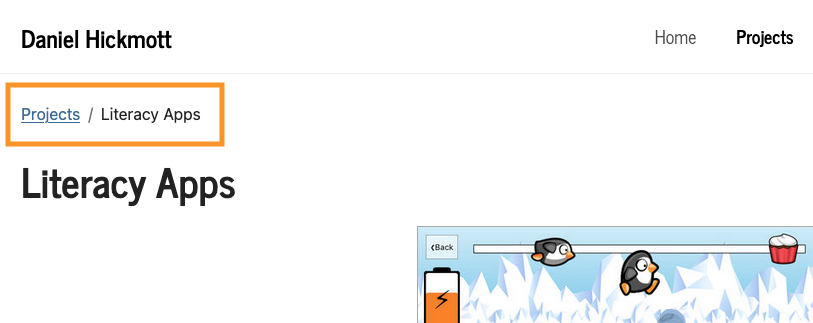
- Breadcrumbs, where a link and text is shown on a page, which helps a visitor understand their location within the site. An example of a breadcrumb on the Literacy Apps project page is shown in the image below.
I also found Claude useful for making changes to multiple pages that could have taken me much longer to do myself. On the page with a report on the Masters of Education program I lectured in, I have lots of links with text that are just a number (for example, 7), which correspond to a reference at the bottom of the page. I was able to use Claude to add an aria-label tag to each link that provides more context when a screen reader navigates to the link. For example, instead of just reading "7", the screen reader would say "Reference 7, Dixson, 2010". It took less than five minutes for Claude to change 23 of these links and around ten minutes for me to review them and verify they were correct. Although I had to spend some time reviewing the changes, the total time was much less than it would have taken to make the changes myself.
I manually fixed most of the issues myself, as it seemed that they were quicker to fix that way than prompting an AI, or because I thought the issue was more suited for a human fix (for example, writing the alternative text for images). However, Claude was very useful and quick for issues where I had to make lots of small updates (such as the article page above). If I did an accessibility review like this again, I would probably use the same approach of both manual and AI fixing of issues.
Conclusion
Using an AI to review the accessibility of a website can help you identify and resolve issues quickly. However, an AI may miss issues that a human would pick up through a more manual review. Writing prompts that tell an AI to look for specific issues (for example, contrast and heading levels) could help but I still think having a human do a review is essential.
I am happy with how my website has been improved by doing this accessibility review, although I recognise that there could be issues I've missed or other improvements I could make to the website's layout and content. If I were to do an accessibility review like this again, I would likely start by using Claude (or another AI) to identify issues. I'd also include more specific instructions in the prompt, to look for issues related to contrast, heading levels and missing figure captions. However, I would also do my own manual review, focusing on areas that an AI is likely to miss.