Dashboard Study
About
During March 2025 to March 2026, I worked as a Postdoctoral Research Fellow on a project focused on the design of fair and equitable Learning Analytics Dashboards (or LADs for short). The project is being led by Associate Professor Erica Southgate, who I worked with on the Literacy Apps project during 2016. The project team consists of researchers from Education and Law from the University of Newcastle, with expertise in a diverse range of fields (including Educational Psychology, Inclusive Education and Privacy Law).
The project has been funded through the Australian Centre for Student Equity and Success' (ACSES) Large grants program. The title of the project is "Fair, Inclusive Learning Dashboards: Student, educator, industry, and legal perspectives".
On this page I share some of the work that I completed during my year-long research fellowship on the project. There will be a report made available later in 2026 that explains the background of the project in detail and reports on its findings. The team will also share the findings from the project in webinars during 2026 and research articles in the future.
What's a LAD?
Learning Analytics Dashboards (or LADs for short) are a type of data dashboard that are commonly used in educational contexts (such as schools and universities). They present information relevant to stakeholders (for example, a teacher could see their students' names and marks), typically in a single view or screen.
The types of information that are presented in LADs will be different for different stakeholders and the information will usually be displayed in a mix of ways. These include bar charts, tables of data, and recommendations. For a university student, a LAD could include bar charts that show their scores in assignment compared to their peers, a table with upcoming assignments and some recommendations for ways to improve their scores in their next assignment.
A simplified example of what a LAD for a university student could look like is shown in the image below.
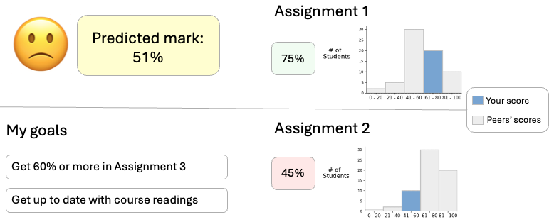
Some LADs include predictive components and recommendations, like those in the image shown above. An example of a predictive component could be a predicted final score, which shows what a student could achieve at the end of the course. Final scores like this can be estimated by looking at the students' scores in previous assignments, their engagement with course materials and other information (including their demographic information). An example of a recommendation in a LAD would be guidance for a student to revisit specific resources in preparation for their next exam.
Predictions and recommendations in LADs can be automated with Artificial Intelligence and can draw on the large amount of data that is collected about students through various digital systems (for example, Learning Management Systems). There are potential issues around bias and accuracy of predictions and recommendations, privacy concerns and the potential for students to lose motivation from predictions and recommendations (for example, where a student who is struggling is shown a low predicted final score and this results in them withdrawing from a course). These issues and concerns were investigated through the project, especially with respect to students' and staff’s perspectives on them.
My work on the project
On this page, I explain three parts of the project that I worked on:
- Design: I designed LADs, which incorporated common features of LADs from research and practice, in consultation with the rest of the team.
- Development: I developed four high-fidelity prototype LADs using web technologies (including HTML, CSS, JavaScript, Vue).
- Analysis: I wrote Python code to analyse logs that were collected during the interviews to understand how students spent their time exploring different parts of the dashboard and which features they used the most.
In addition to these parts of the project, I also
- Reviewed literature in the design of LADs to understand approaches for designing, developing and evaluating them.
- Organised interviews with 81 students and 10 university staff on campus, in which participants used the prototypes I developed and shared their thoughts on them.
- Conducted interviews with several students and staff, and provided technical assistance during all the interviews.
- Managed the data collected through recruitment and interviews accurately, securely and safely.
Design of the LADs
One of the main tasks that I started work on when I began the fellowship was designing the LADs. I designed these in consultation with the research team, who have a wealth of experience teaching, in universities and schools, in online and in-person teaching modes, and coordinating classes that have cohorts of 500+ students each year.
The project proposal set out that we would create simulated LADs (or prototypes) that were teacher-facing and student-facing. We decided early on in the project that we would have two versions each of the teacher-facing and student-facing dashboards, which we called the conventional and agentic dashboards. The conventional dashboard had features and design aspects that are commonly found in current LADs used in practice. The agentic dashboard includes features that are more inclusive (such as information popups that explain what graphs mean, in plain English) and allow students to set goals and reflect on their learning.
The design of the LADs was an iterative and very collaborative process. I created medium-fidelity prototypes using Balsamiq software and shared these with the team regularly to get feedback from them. An example of one of these prototypes is shown in the image below.
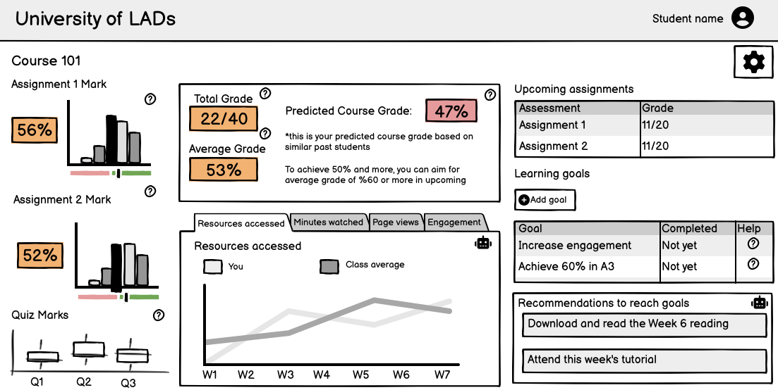
I used the feedback from the team to make improvements to the LAD designs, such as including more inclusive features and making them reflect real LADs more accurately.
I wrote a short conference paper about the experience of designing the LAD, with a focus on the student-facing agentic dashboard, which Erica presented at the ASCILITE conference in December 2025. You can access the paper, "Exploring inclusivity, transparency, explainability and agency in learning analytics dashboard design" from the Open-Publishing website.
Development of high-fidelity prototypes
After we reached a consensus about the design of the LADs, I began developing prototypes that the students and university teachers would be able to use and interact with in the interviews. These were high-fidelity prototypes, which means that they looked like what a LAD used in the real world would, but all of the data was simulated and they were not connected to a real system.
I used the following technologies to develop these LAD prototypes:
- HTML and CSS for the layout and styling, using the Bootstrap framework to speed up development
- JavaScript with Chart.js and Vue to create the different dashboard components, adding interactivity to the prototype, and for logging the different actions the interview participants took when using the prototypes
- Vite with the vite-plugin-singlefile plugin, which allowed me to bundle the prototypes into a single HTML file
Like the medium-fidelity prototypes I created in Balsamiq, I was able to share the high-fidelity prototypes I created with my teammates as a single HTML file, which they could then give feedback on. There will be screenshots and more details of the dashboards in the report that is published by ACSES later this year. However, I’ve included an example of one of the dashboard components in the animation below, which demonstrates some of the interactivity in the high-fidelity prototypes.
The animation above shows some examples of interactivity in the LAD prototypes: the tooltips that appear when hovering over a chart and an information popup for a chart that can be opened and closed.
I completed the development of these prototypes at the start of August 2025 and we began to interview students and teachers that month. During the interviews, students and teachers were given time to explore the prototypes and were asked for their thoughts on different aspects and features of the dashboards. The teachers were shown the teacher-facing dashboards, the students were shown the student-facing dashboards and both groups were asked about whether they preferred the conventional or agentic version. By getting the participants to compare the two versions, we prompted the participants to share their perspectives on the features of the dashboards they liked and didn’t like, as well as what they thought was missing from them. We will share what we found from analysing the participants’ perspectives in the final project report, as well as in research articles in the future.
Analysis of student logs
I included code in the high-fidelity prototypes that logged events during the interviews. There was a large variety of different events that were logged, including when a participant: clicked buttons in the LAD, moved their mouse cursor in and out of different sections of the LAD, and when they hovered over charts in the LAD. The students and teachers were given two minutes in their interview to explore and interact with each of the agentic and conventional LADs without us asking them any questions. By logging the different events during the interview and analysing the logs after using Python code I wrote, we were able to understand how much time participants were spending in the different sections of the LADs and the features they interacted with during the exploration time.
A simplified example of 13 log events that would be captured during an interview are shown in the table below. These events would be logged when participant hovers over a bar chart and opens and closes an info popup (like in the animation shown above in the development section).
| Event time | Event | Data |
|---|---|---|
| 1:53:23 PM | MouseEnteredScore | Assignment 1 Score |
| 1:53:23 PM | MouseLeftScore | Assignment 1 Score |
| 1:53:24 PM | MouseEnteredChart | Assignment 1 Score |
| 1:53:24 PM | HoveredBarChart | Assignment 1 Score;1-4 |
| 1:53:24 PM | HoveredBarChart | Assignment 1 Score;5-8 |
| 1:53:25 PM | HoveredBarChart | Assignment 1 Score;9-12 |
| 1:53:25 PM | HoveredBarChart | Assignment 1 Score;13-16 |
| 1:53:26 PM | HoveredBarChart | Assignment 1 Score;17-20 |
| 1:53:26 PM | MouseLeftChart | Assignment 1 Score |
| 1:53:27 PM | MouseEnteredInfoButton | Assignment 1 Score |
| 1:53:27 PM | InfoPopupOpened | Assignment 1 Score |
| 1:53:29 PM | MouseLeftInfoButton | Assignment 1 Score |
| 1:53:29 PM | InfoPopupDismissed | Assignment 1 Score |
Over the 81 interviews with students, there were around 150,000 events logged by the LADs. This included events that were logged outside of the students’ exploration time and, when I narrowed down to only include the events during the exploration time for analysis, there were around 38,000 events. This worked out to be an average of around 470 events per student, during the exploration time.
Once I had narrowed the events to only those that were captured during students’ exploration time, I wrote Python code to transform the events into a format that showed how much time they had spent in each section of the dashboard. I also reviewed the files from this transformation to check for accuracy and did some data cleaning through this process. After that, I was then able to do a variety of analyses with this data, including looking at sections the students spent the most time in, on average, and the order that students typically moved through different parts of the dashboard in.
I have written Python code to summarise and visualise the time students spent in the different sections of the LADs and the features that they interacted with. I used the seaborn library in Python to create these visualisations, some of which will be included in the project report.
What's next?
The team is currently working on a report that will be published later in 2026 and will also present a series of webinars about the project in 2026 as well. If you are interested in the report, webinars or any other aspect of the project, feel free to email me and I will keep you updated or answer any questions you have.
View My Other Projects